As talked in one of the previous blogs, I rejected some pictures from both of my shoots since I had found flaws in them and not worthy enough of going on the magazine be it as a cover or anything else. This analysis is going to help me what pictures to use at the final stage. The photos below were rejected on the basis of their technical flaws as explained side by side.
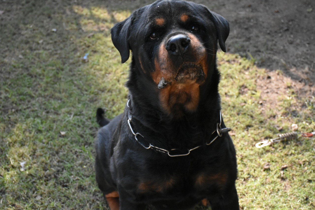
COVER PICTURE:🐾

I would have really liked this as a cover picture but the lighting is too dark and the angle is a bit distorted too.

Although my model looks graceful in this photograph, its head got slightly cut from the top leaving zero head room even for a mid shot.
DOUBLE SPREAD PHOTOGRAPHS: 🐾

The lighting and angle in this shot are perfect for it to be on a double spread but the shot got blurry and the picture got way too much distorted.
The lighting in this shot is too dark and like the technical fault on the cover page photograph, there is no head room in here.
Comments
Post a Comment